
AFB PROJECT: WEBSITE EVALUATION
Date
Role
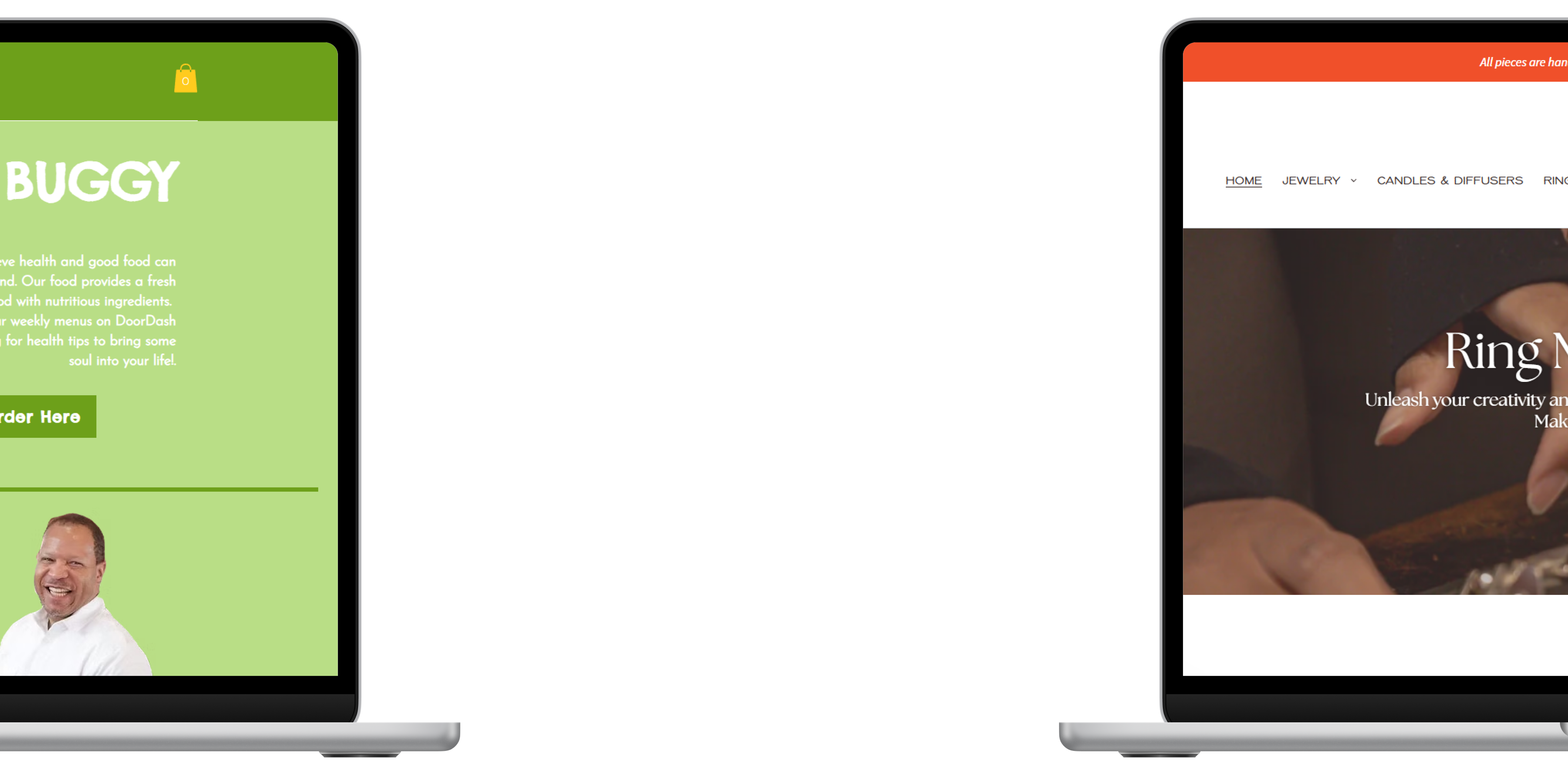
Alternative Fall Break Program
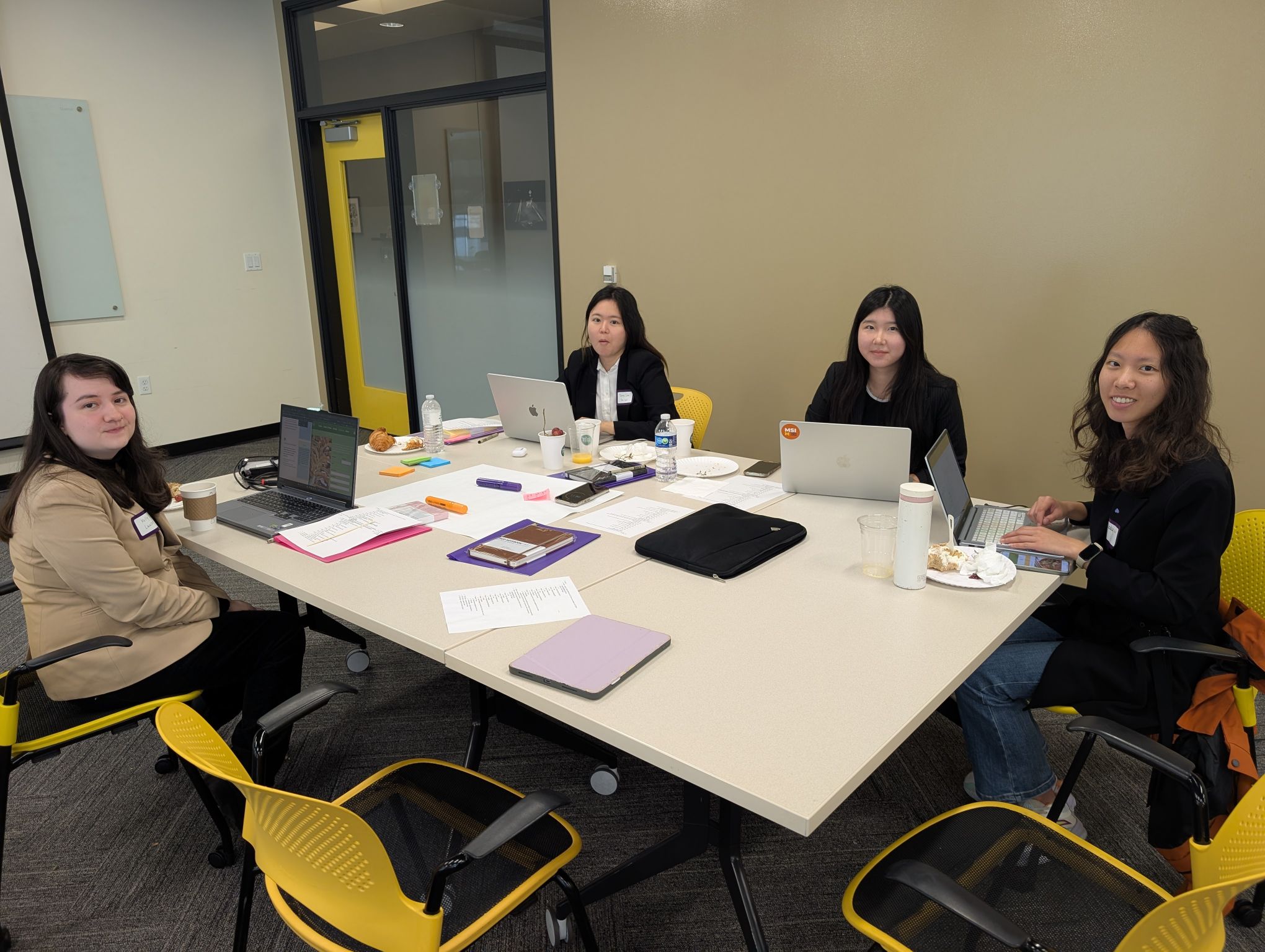
The Alternative Fall Break (AFB) Program is a one-day client consulting experience through the University of Michigan School of Information. Working in interdisciplinary teams of UX and Data Science students, we partnered with small businesses in Detroit to evaluate their websites and deliver user-centered recommendations to improve usability, accessibility, and overall customer experience.
About Clients
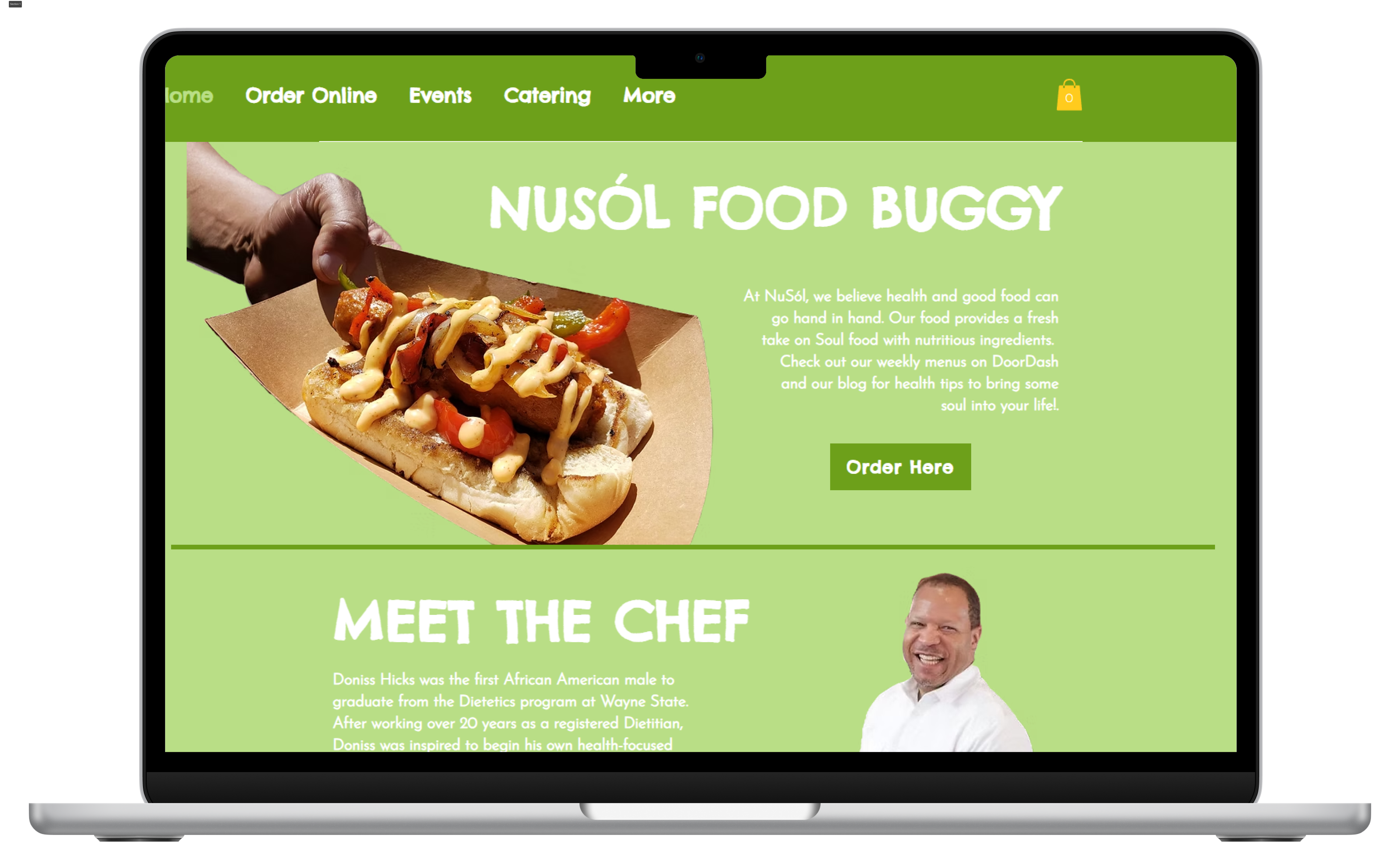
NuSól is a Detroit-based restaurant that offers a healthier take on traditional soul food, emphasizing nutritious ingredients without sacrificing flavor. Their website supports multiple customer goals, including viewing menus, placing online orders through DoorDash, and engaging with health-focused blog content.
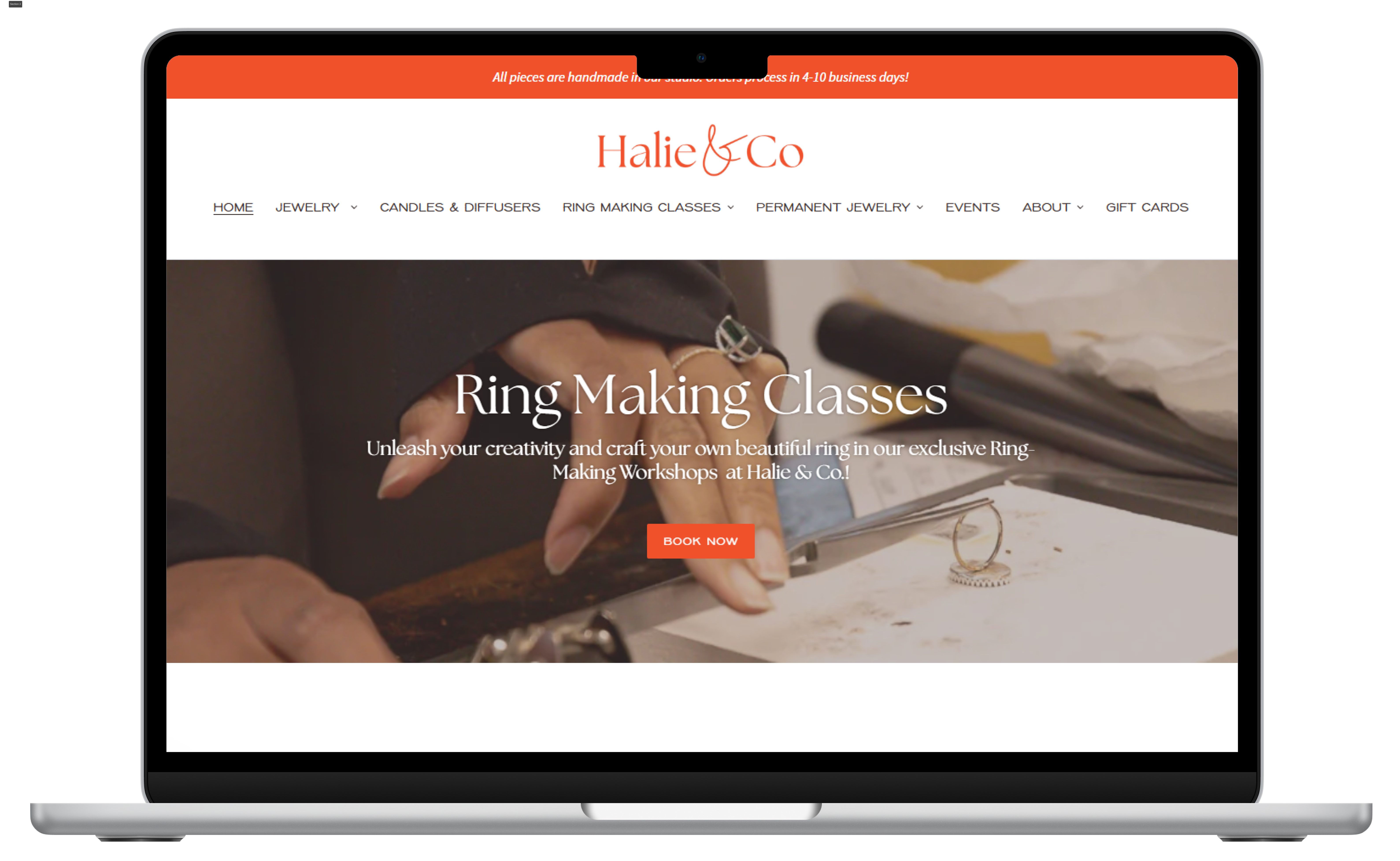
Halie & Co. is a Detroit-based small jewelry store that specializes in handcrafted 14K gold-filled and sterling silver jewelry. In addition to jewelry, the brand also offers lifestyle products such as candles and diffusers as well as in-person ring-making classes that allow customers to engage directly with the brand’s creative process.
Methods
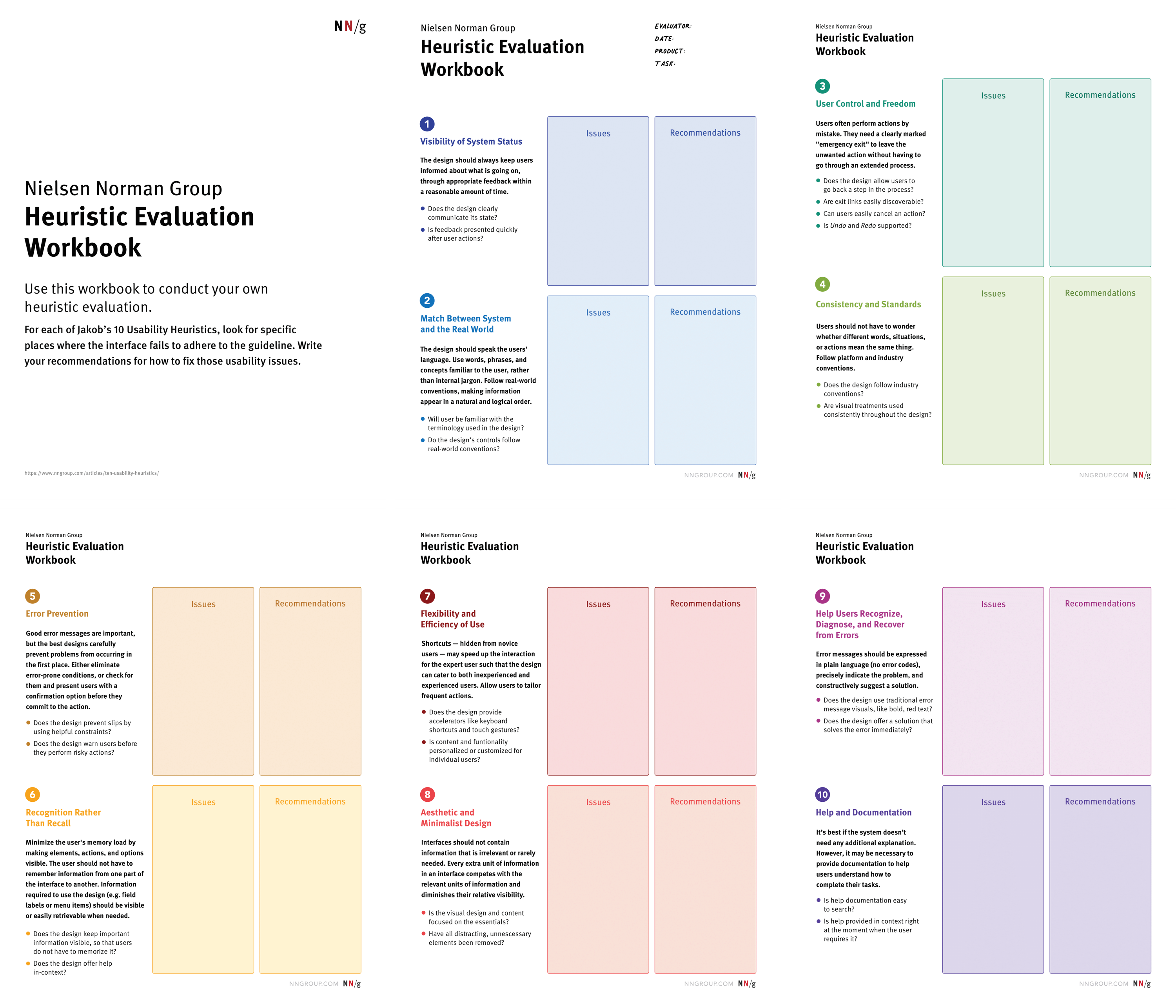
The primary method used to evaluate and consult on our clients’ websites was heuristic evaluation. We assessed each site against established usability principles to identify issues affecting navigation, clarity, accessibility, and overall user experience. In addition, we examined visual elements such as layout, color usage, and typography to understand how design choices supported or hindered the website's experience.
Client 1:
Nusól's Needs & wants:
🍴Increase successful online orders by helping users easily find, understand, and purchase products
📈Improve user engagement and time spent on site, particularly with blog content
💻Attract new customers by creating a clear, trustworthy, and easy-to-navigate website experience
major challenges
❌Limited availability for direct client interviews made it difficult to fully clarify stakeholder priorities early in the process.
❌We had to only rely on previously provided client responses and had to make informed decisions about which areas of the website would deliver the greatest overall impact.
❌Due to timing constraints, we adapted our process by conducting the heuristic evaluation before the client interview and later validating our findings through stakeholder feedback.
Process


We then created an impact map to break down core usability problems and understand how proposed changes could influence user behavior and business outcomes.


After organizing our focus through impact map, we conducted page-level reviews by dividing website sections among team members and documenting usability issues and user pain points through collaborative annotation.
Findings
Through heuristic evaluation, we identified several high-impact usability issues that could affect accessibility, clarity, and user trust across the website.
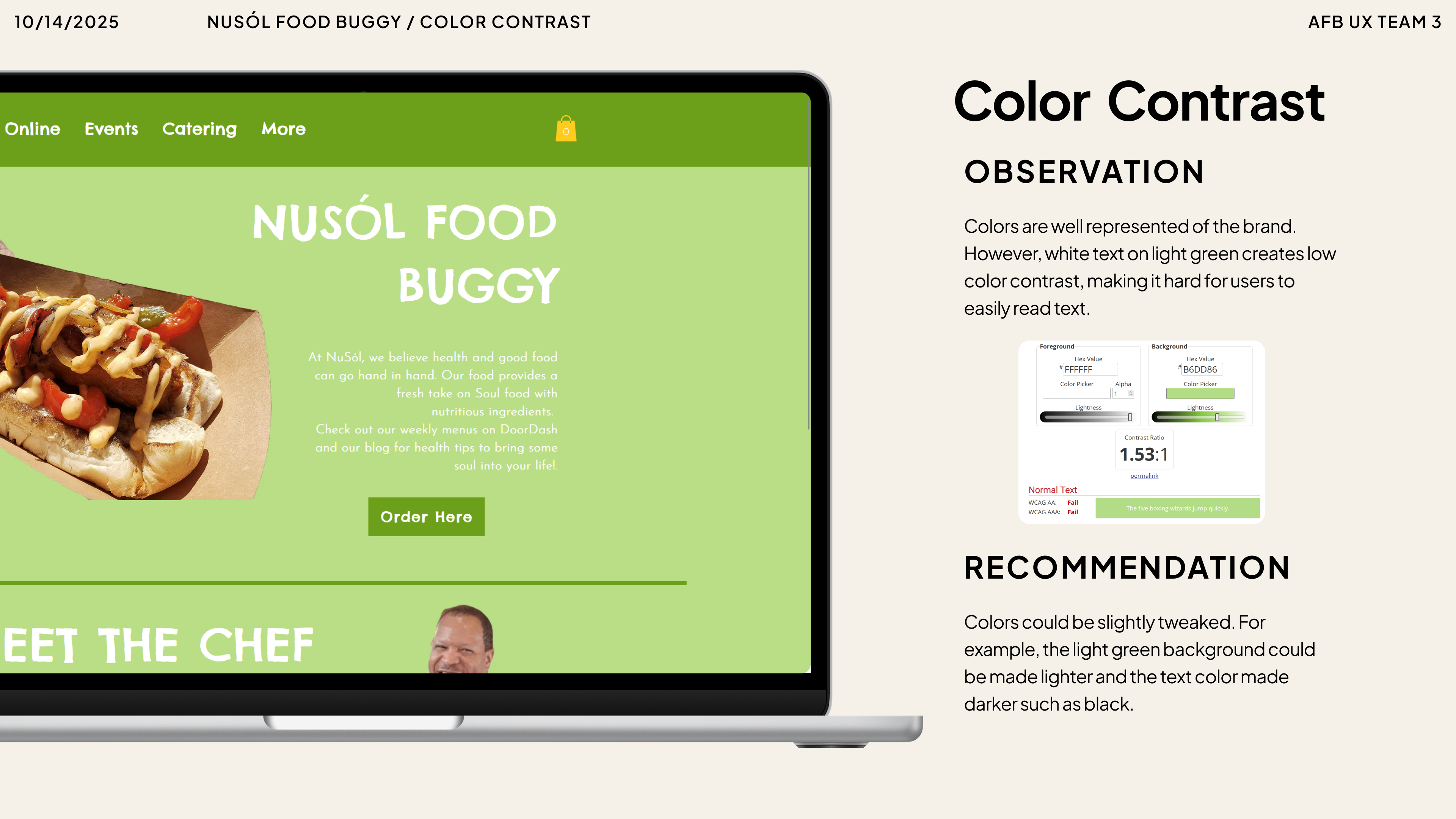
1. Accessibility & Readability Issues:
⚠️Insufficient color contrast between green backgrounds and white text reduced readability, particularly for users with low vision
⚠️Several text elements did not meet accessibility best practices, increasing cognitive effort and visual strain.
Total heuristics the website violates:
🔺Visibility of System Status
🔺Consistency and Standards
🔺Aesthetic and Minimalist Design
🔺Help Users Recognize, Diagnose, and Recover from Errors
🔺Help and Documentation
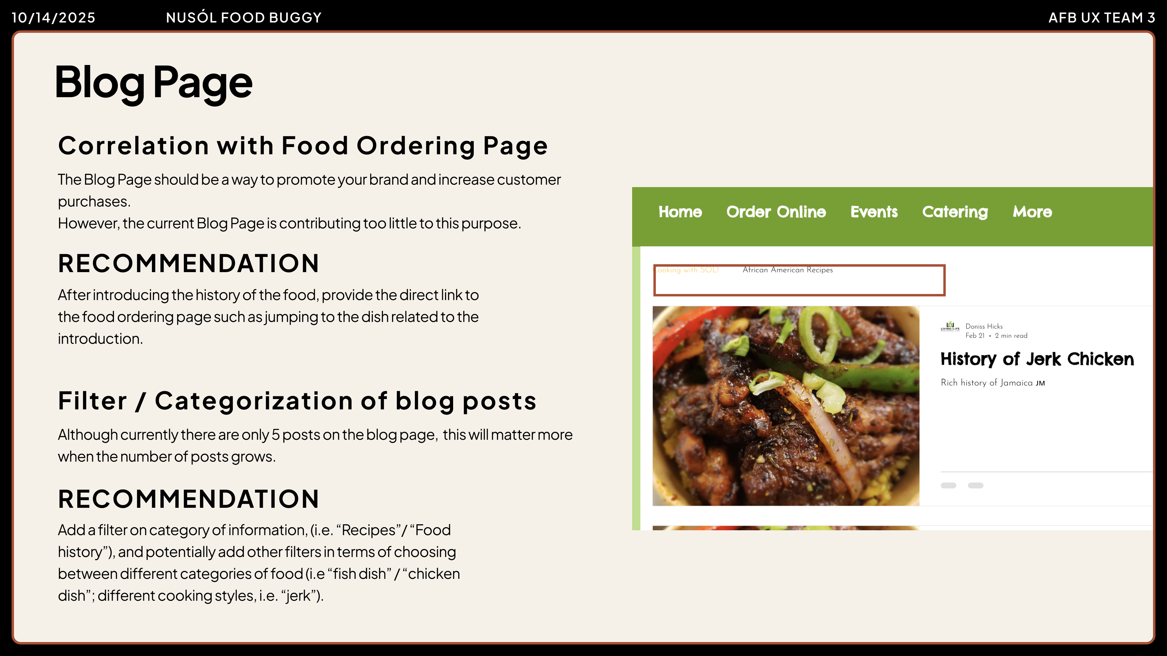
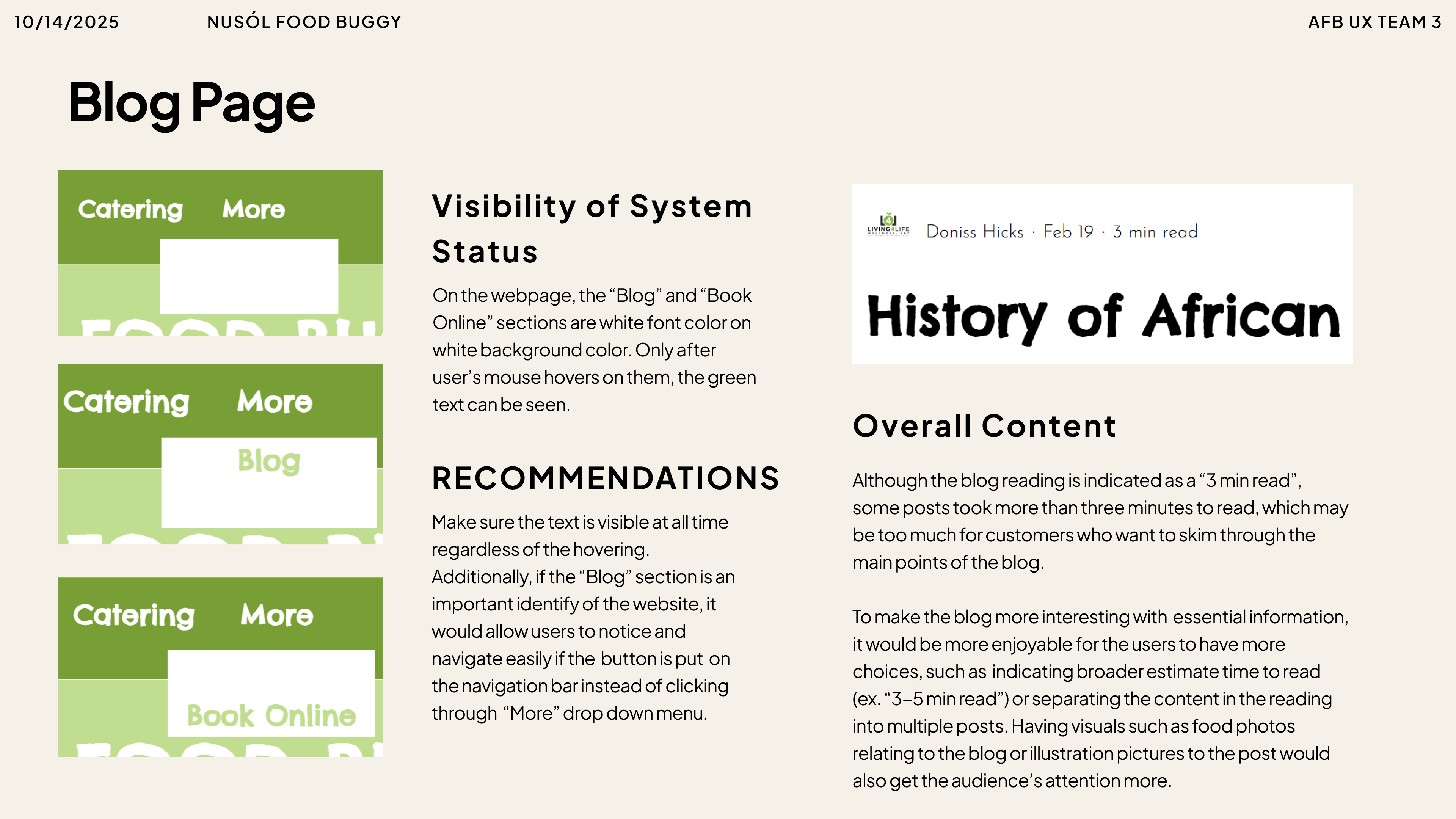
3. Content & Engagement Issues (Blog)
⚠️Blog post length indicators did not accurately reflect actual reading time.
⚠️Limited access to relevant blog content and unclear organization may reduce user engagement and return visits.
Related heuristics: Consistency and Standards, Help Users Recognize and Recover from Errors
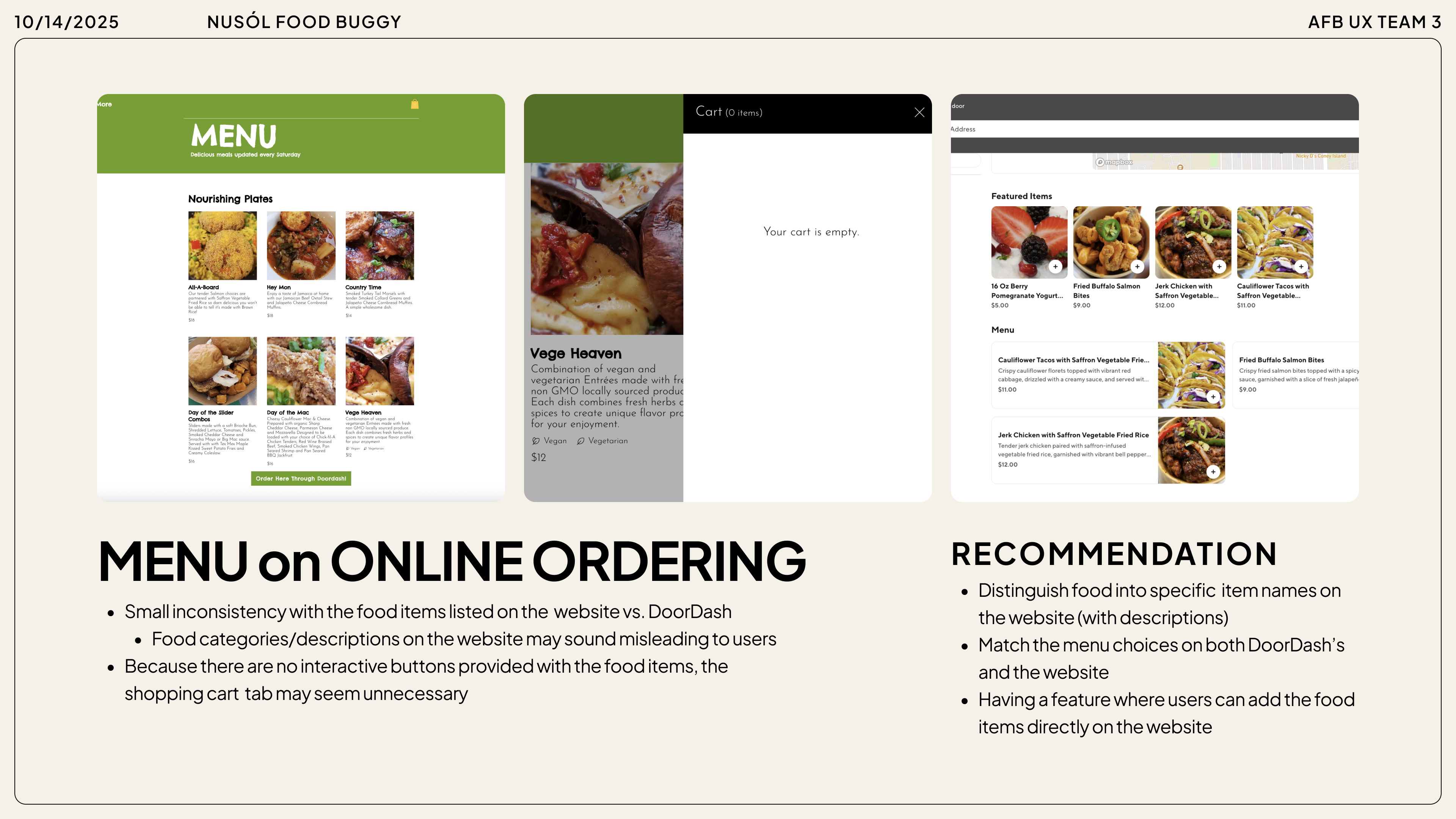
2. Consistency Across Platforms
⚠️Menu items listed on the website did not match those shown on the business’s DoorDash page.
⚠️These inconsistencies could confuse users and reduce trust during the ordering process.
⚠️A shopping cart button on the menu page did not lead to any action, creating false affordances.
⚠️Navigation buttons were only visible on hover, limiting discoverability and increasing reliance on trial-and-error.
Related heuristics: Consistency and Standards, Visibility of System Status
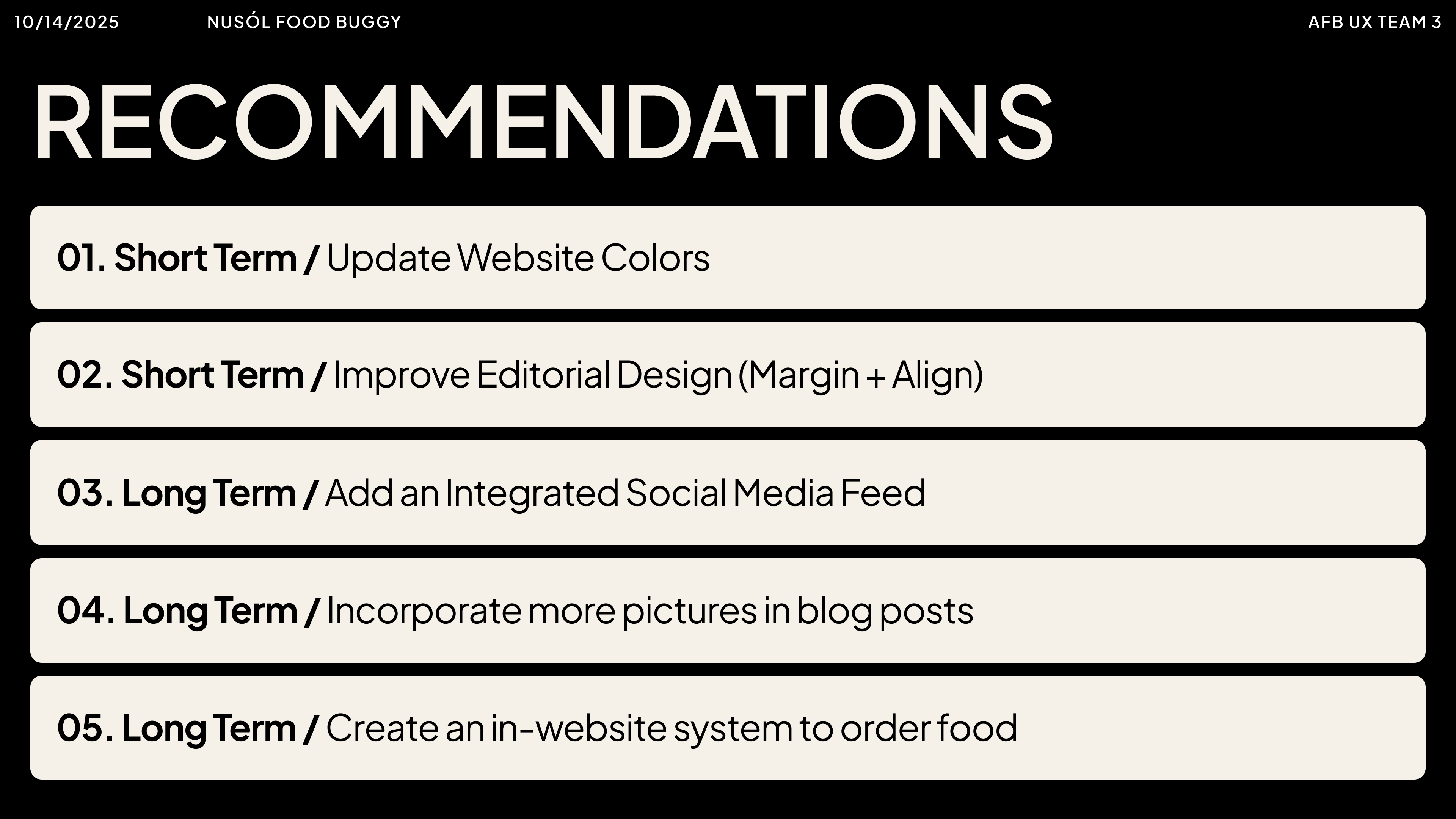
Based on our findings, we converted key problem areas into specific recommendations, organizing them into short- and long-term goals to help the client improve the overall user experience of their website.
client 2:
Halie & Co 's Needs & wants:
🛍️Increase online orders by encouraging more website visits and supporting customers who primarily shop in person
💍Improve the Ring-Making Class page, a key attraction for the business, to better inform and convert interested users
💻Create a clearer, more intuitive website structure to help users easily navigate products, classes, and key information
major challenges
❌The website contained numerous pages and navigation paths stemming from multiple icons, which initially made it challenging to synthesize information and create a structured evaluation.
❌We had limited time compared to Client 1 required us to prioritize high-impact areas and make efficient and evidence-based recommendations.
Process
❗We prioritized key pages specified by the client: homepage, navigation bar, product pages, and Ring-Making Class registration.
❗We then divided pages among team members, annotating usability issues and documenting potential user pain points for each section.


Findings
Through heuristic evaluation, we identified several high-impact usability issues that could affect accessibility, clarity, and user trust across the website.
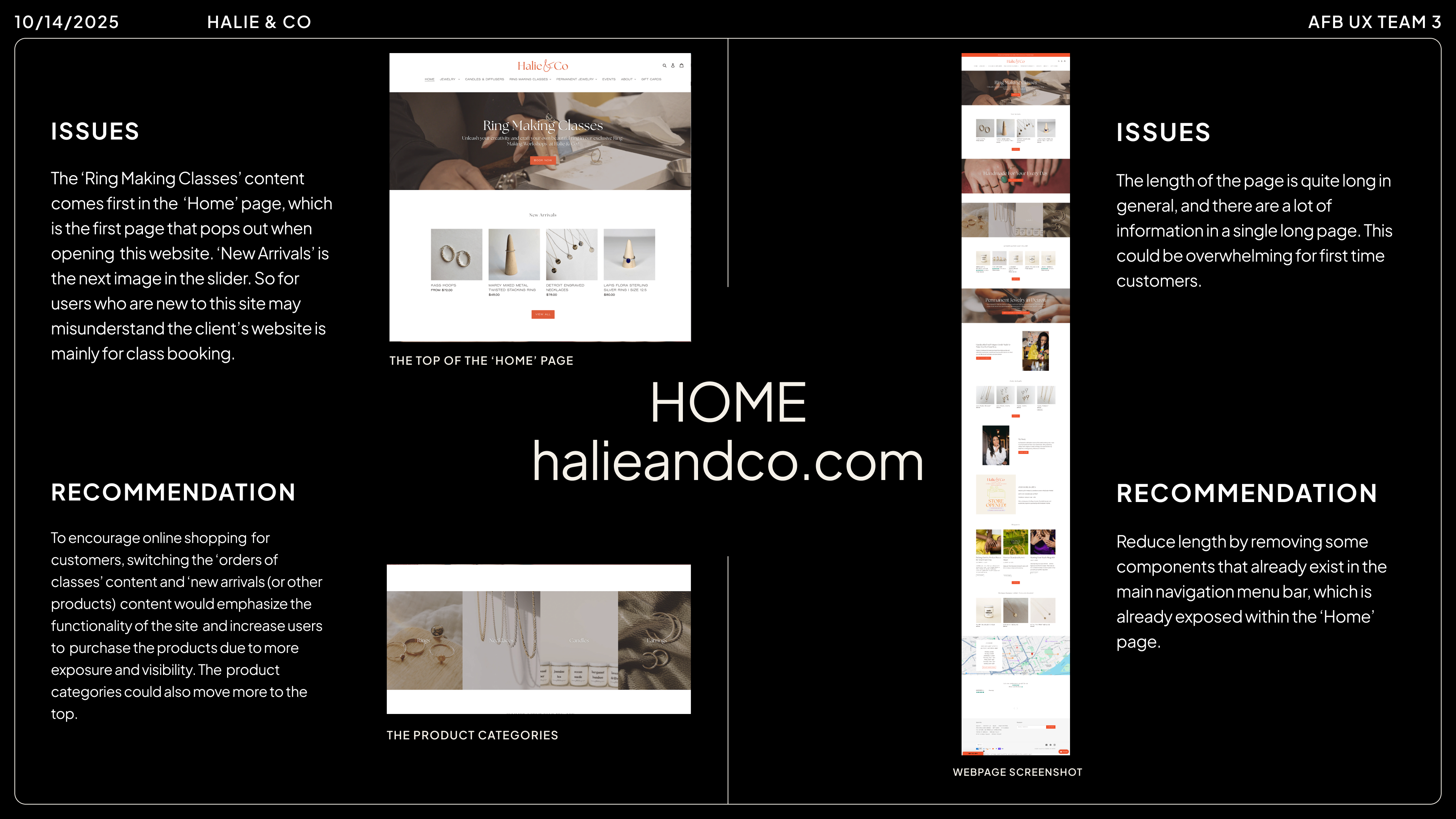
1. Homepage & Ring-Making Class Banner
⚠️The homepage prominently features the Ring-Making Class banner, which may mislead visitors about the primary purpose of the site as a jewelry store.
⚠️Excessive information on the homepage and navigation bar can overwhelm users, making it difficult to find key content and navigate effectively.
Related Heuristics: Visibility of System Status, Match Between System and the Real World, Consistency and Standards
Total heuristics the website violates:
🔺Visibility of System Status
🔺Match Between System and the Real World
🔺Consistency and Standards
🔺Aesthetic and Minimalist Design
🔺Help Users Recognize, Diagnose, and Recover from Errors
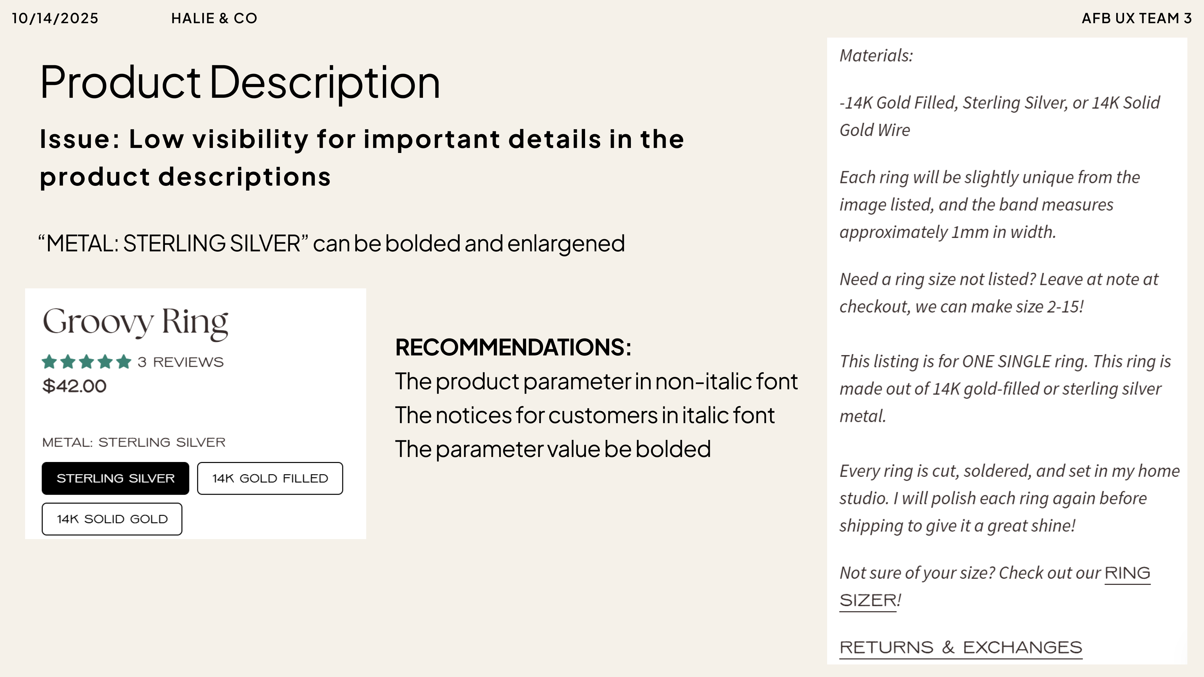
4. Descriptions for products may not gather enough attention and indication in product pages (font misusage)
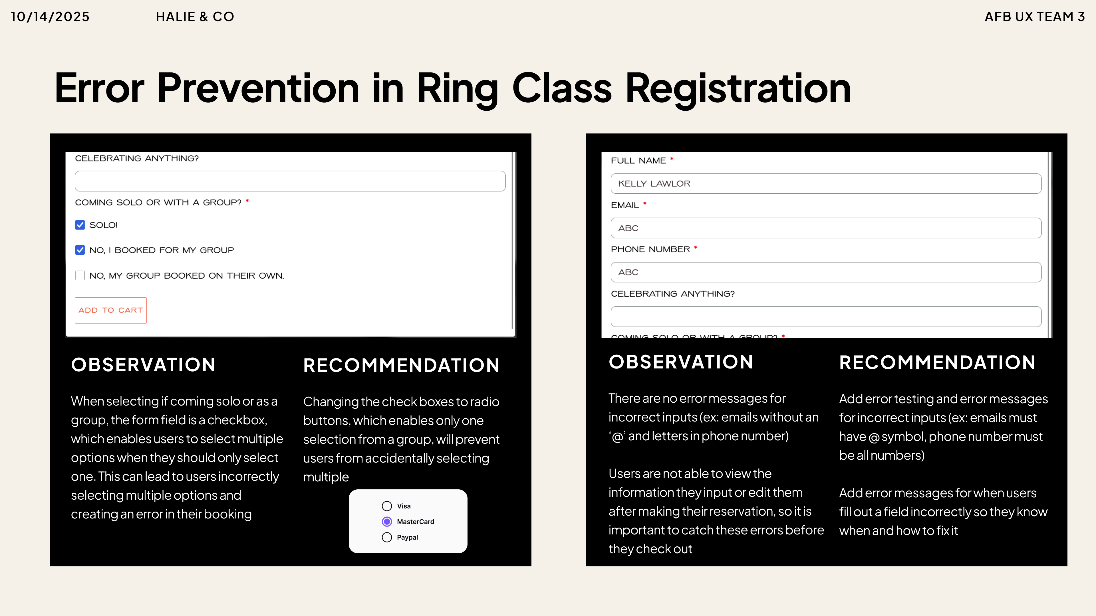
3. Misleading and empty information for ring class registration in dialog box
Related heuristics: Visibility of System Status, Help Users Recognize, Diagnose, and Recover from Errors
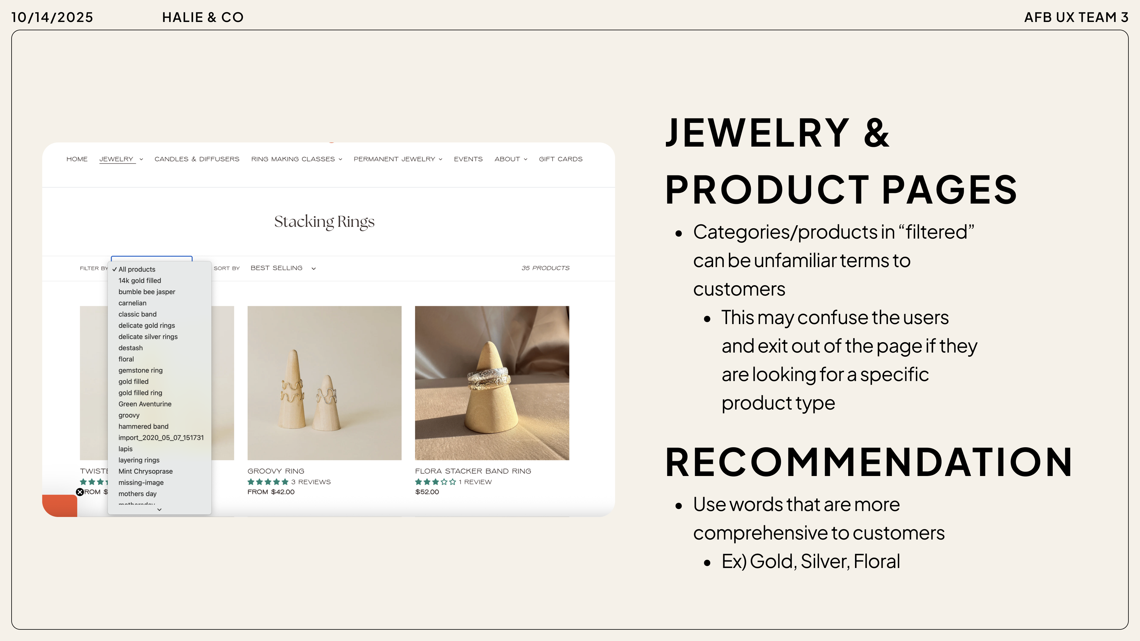
2. Jewelry & Product Pages
⚠️Category labels and filtered tabs use terminology that may be unfamiliar to users, potentially creating confusion.
⚠️Ring class registration dialog boxes contain incomplete or misleading information, which could frustrate users.
Related Heuristics: Consistency and Standards
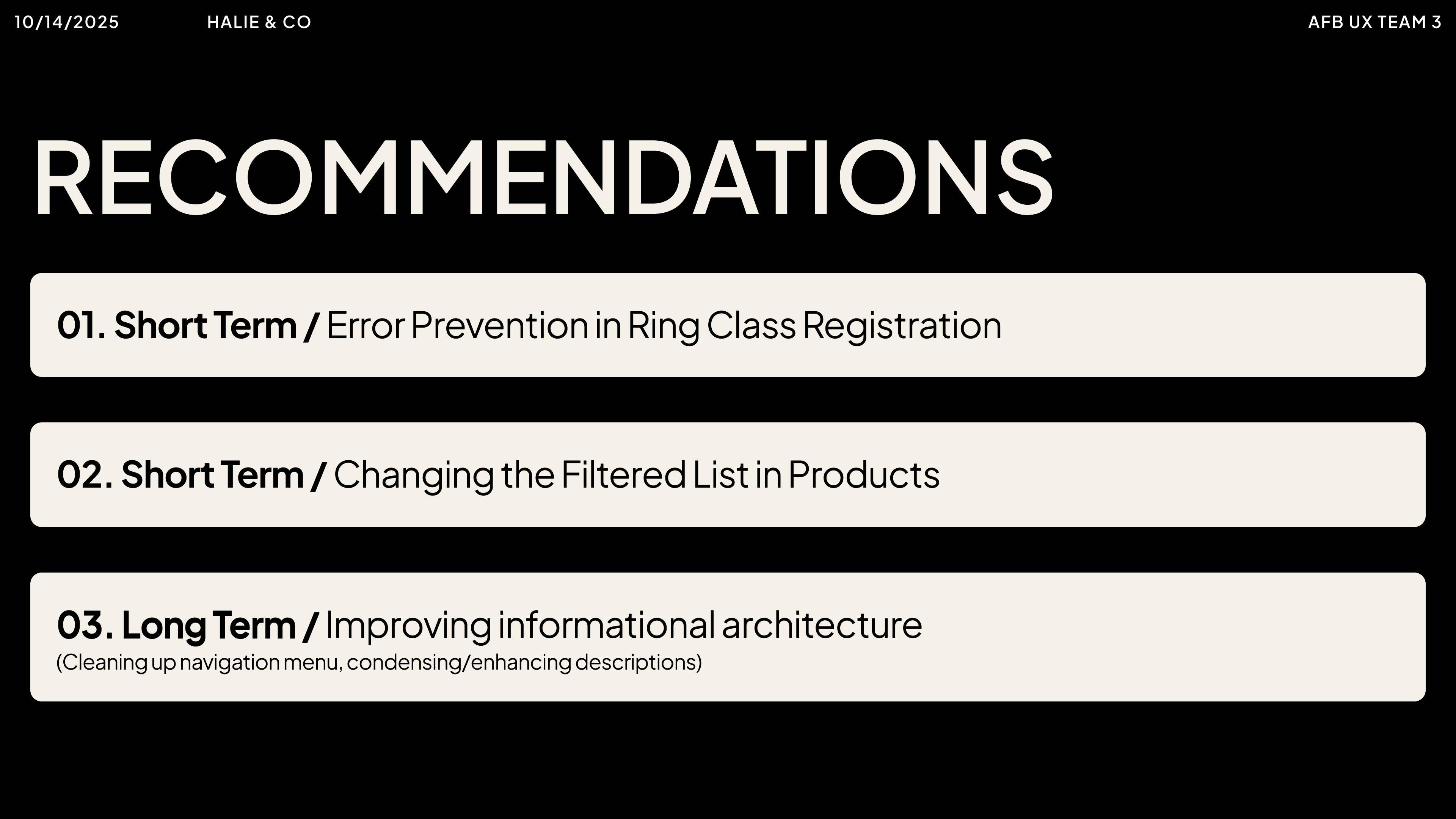
Based on our findings, we converted key problem areas into specific recommendations, organizing them into short- and long-term goals to help the client improve the overall user experience of their website.
reflection & impact
Through this experience, I gained a deeper understanding of heuristic evaluation as a UX method and how it can be applied in real client contexts. One of my most important takeaways was the role of empathy, not only toward users of the website, but also toward the clients themselves. While user-centered design is essential, this project reinforced that incorporating a client’s perspective, goals, and constraints is equally important in creating meaningful and realistic design recommendations. Working with small business owners from diverse socioeconomic, cultural, and geographic backgrounds highlighted the importance of considering context when evaluating and designing digital experiences. Each client brought unique values, priorities, and limitations, which shaped how their websites functioned and how improvements should be approached. I also recognized the importance of building rapport and trust within my team. Spending time getting to know one another helped create an environment where feedback was shared openly and respectfully, allowing us to collaborate more effectively under time constraints. Overall, my biggest takeaway from this project was learning to meet both users and clients at eye level—balancing empathy, practicality, and UX best practices to deliver thoughtful recommendations.